Website Design & DevelopmentOcean Enterprise
Shared:


The Typeface
The typography for Ocean Enterprise’s website uses Krona One for headings, giving a strong, attention-grabbing presence, and Montserrat for body text, ensuring readability and a contemporary feel, supporting the firm’s modern aesthetic and the professionalism of their interior design showcase.

The Brand Colors
Ocean Enterprise features a palette that draws from the depths of the ocean to the richness of gold. Deep navy and vibrant azure reflect the firm’s proficiency in design that ranges from the classic to the contemporary, while rich gold hues add a touch of luxury, emphasizing the high-quality service they provide.


Research
The research phase is a critical starting point, laying the foundation for the entire project. This stage is about immersing into the industry, the client’s history, and their target audience to inform every subsequent design decision. From initial discovery through to defining key objectives, progressing to UI design, development, and final hand-off, this is where strategic and creative alignment with the client’s vision begins. It sets the trajectory for creating a solution that’s both aesthetically pleasing and functionally robust.
Discovery
───
───
UI Design
───
Development
───

The Site Map


The Wireframe

Website Design


The Local Coffee Shop

Aura
Rehash Gastrobar

Pet Central
Workwiz
Ocean Enterprise

Colossal Atelier

Bladerite
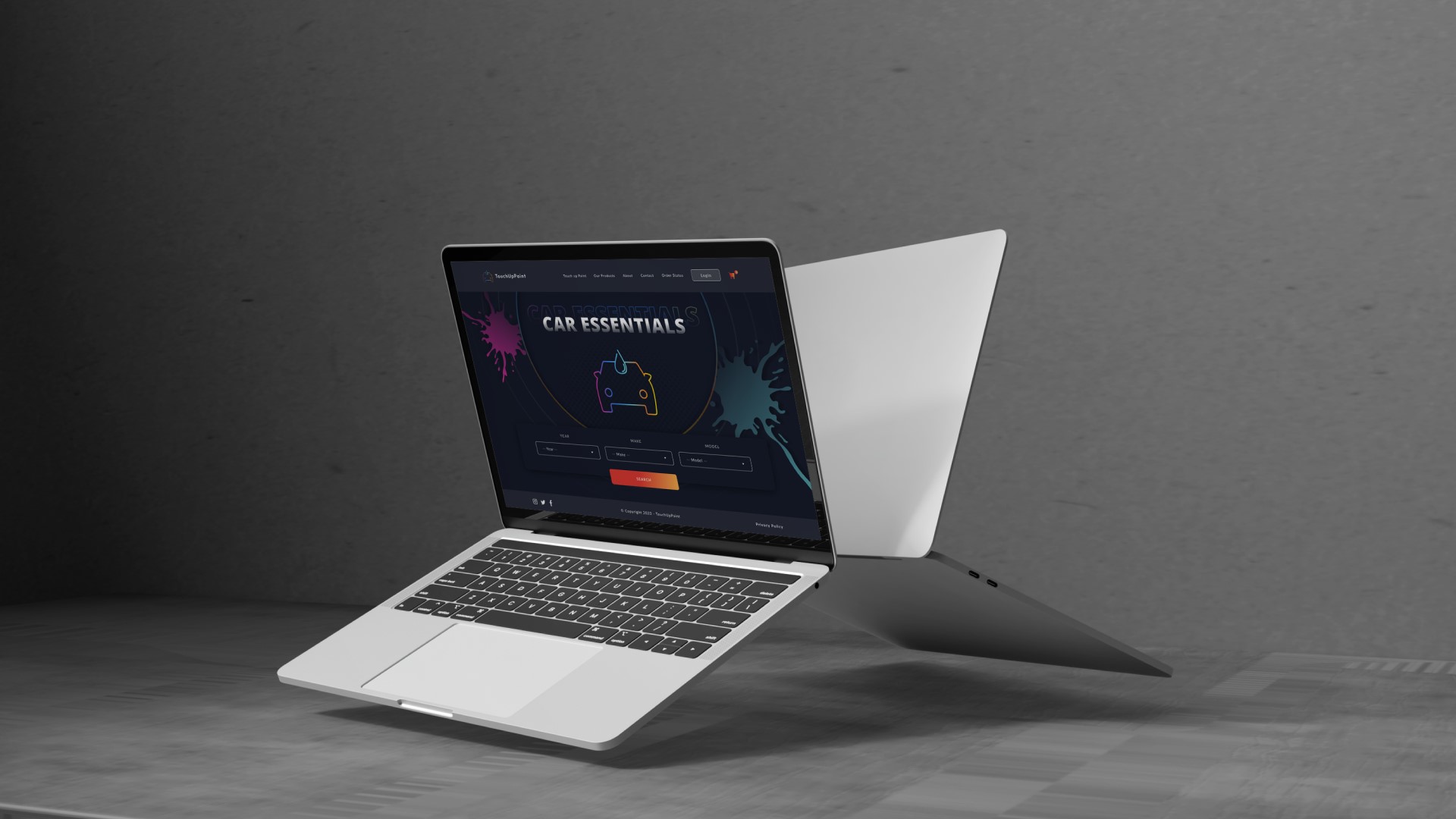
Car Essentials
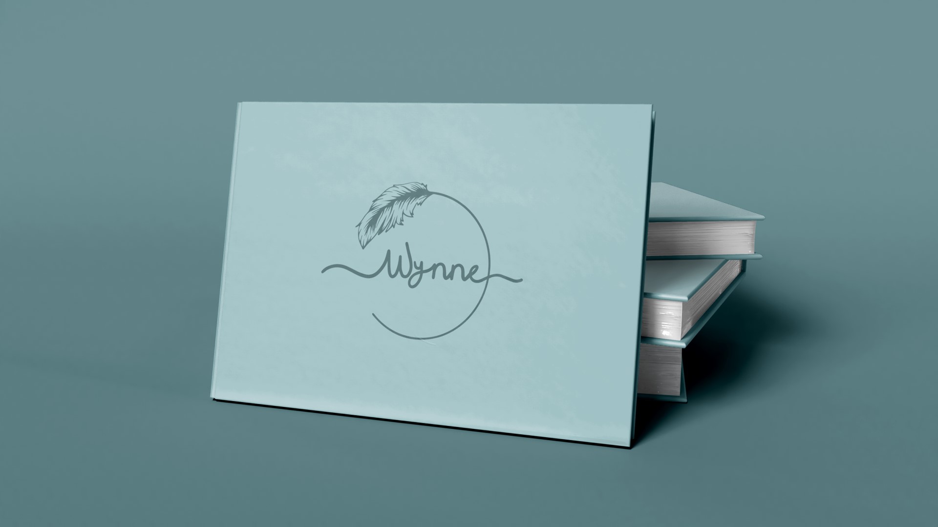
Wynne