User-Centric Website DesignBladerite
For Bladerite, we developed a dynamic website tailored to showcase an NFT game project. Our design prioritizes user experience, guiding players through an intuitive flow where they can connect their MetaMask wallets, view rankings, and track earnings within a fully integrated NFT marketplace. The platform we’ve created not only highlights the game’s features but also facilitates a seamless user interaction with the digital assets involved.


The Brand Colors
The Brand Colors
Bladerite’s brand colors evoke the deep, immersive atmosphere of its gaming world. Dark tones for depth and mystery, with contrasting gold for highlights and rewards, set a dramatic stage fitting for an NFT adventure.


The typography for Bladerite utilizes the Lexend font family, offering a range of weights from Extra Bold to Regular. This typeface is selected for its legibility and futuristic appeal, complementing the game’s theme and enhancing the user interface with a clean, contemporary look.
Typography

Lexend
Extra bold - Bold - Semi bold - Medium - Regular
abcdefghijklmnopqrstuvwxyz
ABCDEFGHIJKLMNOPQRSTUVWXYZ
0123456789!@#$%^&*()-=

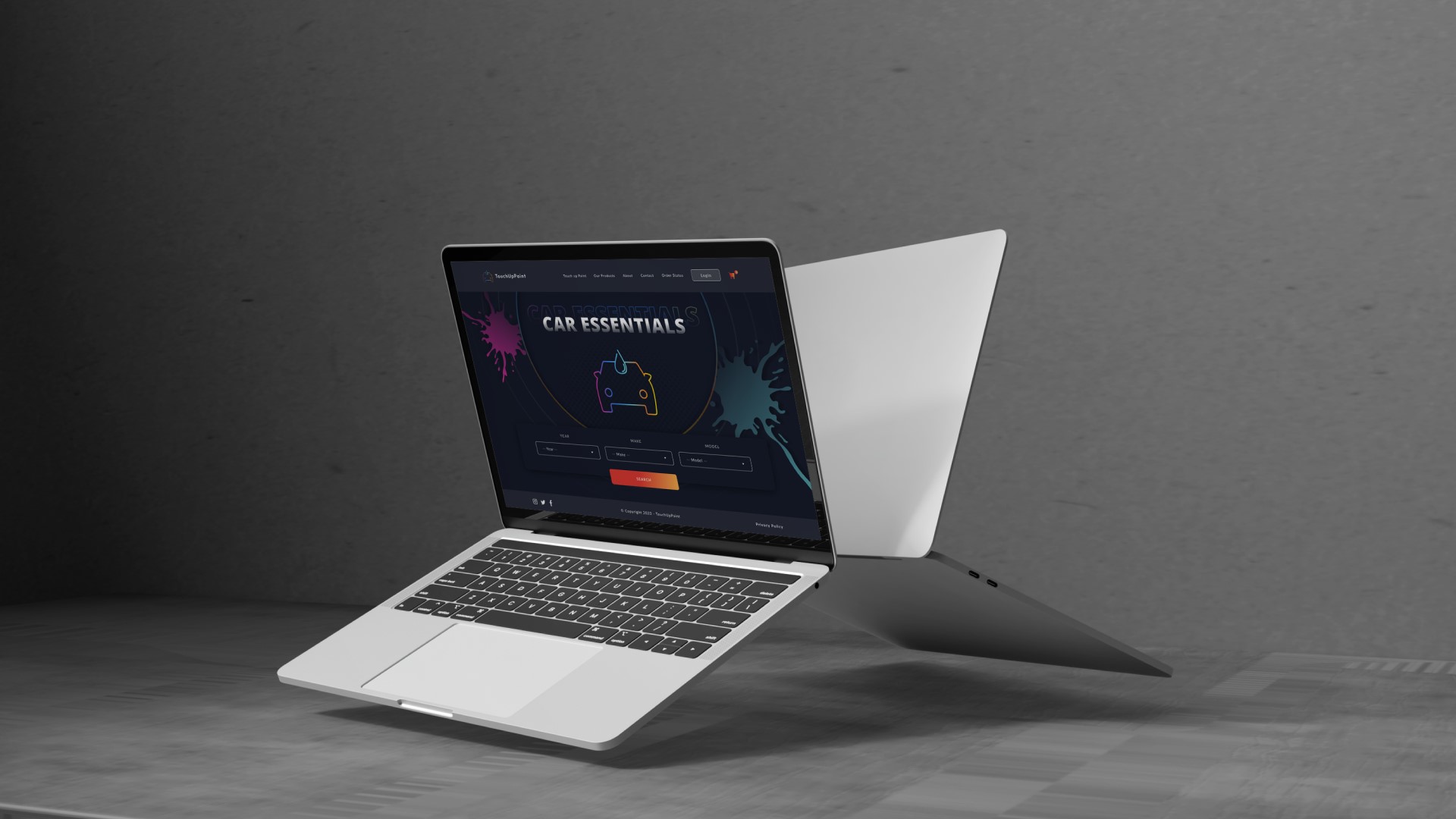
Website Design
Check the website
The website design for Bladerite is intricately crafted to reflect the game’s immersive aesthetics. With ease of navigation as a priority, elements are overlaid, creating a sense of depth and dimensionality, while shadows are skillfully used to enhance contrast and focus. This design technique not only draws users into the Bladerite world but also creates an engaging and interactive experience as they explore the site.